Color Psychology in Marketing: What Nigerian Brands Need to Know

    Up to 90% of snap judgments about a product are based on color alone. Here’s what the science says, what it means and how to use it without guessing.

    Jump to
     Color Psychology in Marketing: What Nigerian Brands Need to Know
    Illustration · CareerBuddy

    Why You Trust Some Brands Before They’ve Said a Word: The Psychology of Color

    The brain makes a judgment about a product in under 90 seconds. Research suggests up to 90 percent of that judgment is based on color. Most Nigerian brands are not using this information.

    Walk through any major Nigerian supermarket and stop in front of the banking or fintech promotional materials. Every brand handling your money is blue or dark green. The cleaning products are blue and white. The premium personal care products are in black or deep burgundy. None of this is a coincidence, and none of it is purely aesthetic. It is applied psychology, and the brands that have studied it are running a conversation with your brain that started before you read a single word of their copy.

    Color psychology is the study of how specific hues reliably influence perception, emotional response, and decision-making. The effects operate below conscious awareness — research suggests the emotional association to a color is processed faster than the conscious mind can engage with the product’s actual claims. You have a feeling about a brand before you have an opinion about it, and color is the primary mechanism producing that feeling.

    Research published in the journal Management Decision found that up to 90 percent of snap product judgments can be based on color alone, depending on the product category. For Nigerian marketers, brand builders, and business owners, this is not a creative consideration. It is a strategic one.

    •   •   •

    How Color Works in the Brain

    how colors work in the brain

    The mechanism behind color psychology is a process called chromatic priming. Over years of exposure to consistent color-context pairings — red on emergency vehicles, green on organic produce, blue on financial institutions — the brain builds automatic associations that fire when the color appears, before any deliberate processing begins. The association is not universal or fixed. It is culturally and contextually constructed, which means it shifts depending on what surrounds the color and what the viewer has been trained to expect.

    The same shade of red on a stop sign produces a warning response. On a sale banner, it produces urgency and opportunity. On a premium cosmetics package, it can signal sensuality and confidence. The color has not changed. The context has, and context rewrites the emotional signal entirely.

    What stays consistent across contexts is that color pre-loads an expectation before any other information lands. A website built in blue enters the viewer’s perception with a head start on trust. A clearance sale in red enters with a head start on urgency. A premium product in matte black enters with a head start on exclusivity. Your copy, your claims, your pricing — all of these are processed through the filter that the color has already established. Get the color wrong and your copy is swimming upstream from the first second.

    •   •   •

    Blue: The Architecture of Trust

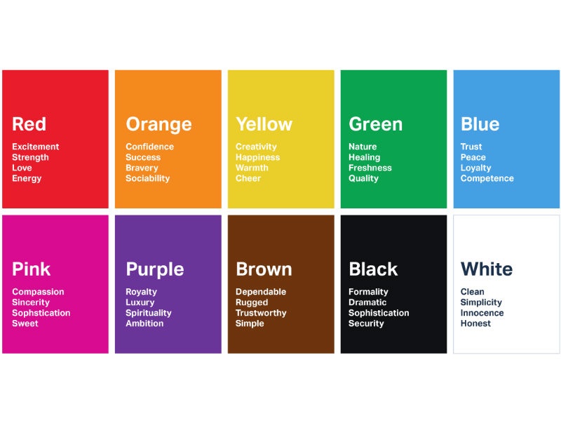
    Blue is the most consistently preferred color across demographics globally, and its primary psychological function is the establishment of trust and reliability. Financial institutions have understood this for so long that the association has become self-reinforcing: people expect financial services to be blue, which means any financial brand in blue feels immediately familiar, and any one that departs significantly from that palette has to work harder to establish credibility.

    In the Nigerian fintech landscape, this is visible in how the sector’s largest players position themselves. Brands handling your money, your identity, your transaction history tend to deploy blue — or dark green, which carries adjacent associations of security and stability — across their primary touchpoints. The color is doing trust-work before the product feature list gets a chance to.

    For any Nigerian business handling sensitive data, financial information, or anything requiring a customer to extend trust before experiencing value — the color palette of your brand is not a secondary conversation. It is the first conversation, happening at a level the customer is not consciously aware of. A payment platform in bright orange may be functionally identical to one in deep blue, but it will start every customer interaction with a different emotional baseline. In a market where digital trust is still being built, that baseline matters significantly.

    •   •   •

    Red: Manufacturing Urgency

    Red compresses decision-making time. This is its primary utility in commercial contexts, and one of the most consistently documented effects in consumer psychology research. Studies on purchasing scenarios find that red visual cues consistently produce faster, less deliberative decisions. Buyers think less and act more quickly.

    This is why clearance sections at every major retailer globally are red. Not because red is attractive, but because the purpose of a clearance section is to reduce deliberation and accelerate conversion. The customer standing in front of a clearance rack is not supposed to be carefully evaluating long-term value. They are supposed to feel urgency about a time-limited opportunity and act before the feeling passes. Red serves that goal efficiently.

    In Nigerian digital commerce and social media advertising, red is significantly underdeployed as a deliberate urgency mechanism rather than a general attention device. The distinction matters. Red placed arbitrarily on an ad increases visibility but does not necessarily produce urgency. Red placed specifically on a countdown timer, a limited-stock indicator, or a call-to-action button in the context of a genuine time-limited offer activates the urgency mechanism with far more precision.

    The caveat: urgency created falsely erodes trust over time. If every promotion is urgent, none of them are. Nigerian consumers have become sophisticated about manufactured scarcity, and a brand that deploys red urgency signals around offers that are not actually time-limited will find both the effect and its credibility diminishing together.

    •   •   •

    Breaking the Category Color Code

    Colors mean something

    The most interesting color decision a brand can make is the one that deliberately breaks from its category’s conventions — when done with purpose, when the departure communicates something true about the brand’s positioning.

    A new Nigerian fintech launching in warm yellow or coral rather than the expected blues and greens is not making a random aesthetic choice. It is claiming a position: we are different from the financial institutions you have experienced before, more approachable, less formal, designed for a different kind of user. The color carries that message at a pre-verbal level before the product has made a single claim.

    This strategy requires the rest of the brand experience to be consistent with what the color promises. A company that uses playful, warm colors to signal approachability and then delivers a frustrating onboarding experience or a customer service process that feels like a government ministry has created a dissonance that damages trust more than a conventionally colored brand would experience. The color raised an expectation. The product failed to meet it.

    •   •   •

    What to Do With This

    If you are building a brand or a product in Nigeria right now, the practical implication of everything above is that color deserves a strategic conversation before it gets a creative one. The question is not “which colors do we like?” It is: what emotional promise are we making to the customer, and what color is most likely to communicate that promise before we have said anything else?

    For established brands, it is worth auditing current color use against the actual customer emotional journey. What does the customer feel when they first encounter the brand? Is that the feeling you are trying to create? Is the color working in the same direction as the copy and the product experience, or is it creating a signal that the rest of the brand then has to overcome?

    Color is not decoration. It is the first line of the conversation your brand is having with every person who encounters it, speaking in a language the conscious mind is not fluent in. The brands that understand this are running a more effective conversation than the ones that don’t. The gap is not in budget or production quality. It is in whether the conversation was designed at all

    Related: Got a Raise? Here’s Why You Still Feel Broke (and How to Fix It)

    Advertisement

    Advertisement

    In-Article Ad

    Native ad placement

    Ultimate CV Template for African Tech Roles
    Free Download

    Ultimate CV Template for African Tech Roles

    ATS-friendly CV template designed for tech jobs in Lagos, Nairobi, Cape Town, and remote positions.

    Get this on WhatsApp

    Join the CareerBuddy WhatsApp Group for daily career, salary, and AI-at-work intel for African professionals. Free, two taps.

    More Stories You'll Love

    Discussion

    Sign in or create a free CareerBuddy account to join the discussion. Comments are moderated; abusive posts are removed.

    No comments yet. Be the first — set the tone.